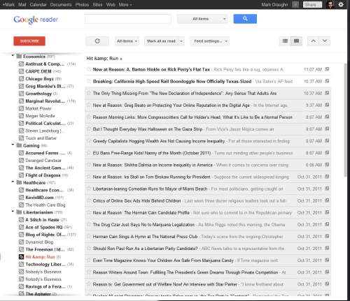
It looks like Google has decided to screw up Reader with a new design:
I guess they wanted it to have a more modern-looking design, and I suppose it looks nicer, but it’s kind of goofy from a usability standpoint. The biggest problem is that everything is, well, bigger. They’re following the modern web design trend of separating things on the page with space rather than graphical components.
The thing is, though, nobody visits a web page for its use of space. You visit a web page for its content. Now, your enjoyment of the content is affected by how it’s presented, of course, but the presentation should enhance the content, not hinder it or overwhelm it.
So what’s the content of Google Reader? Links to other content. Users of Reader want to be able to scan through dozens or hundreds of items to see what looks worth reading. That means a good page design for a feed reader should present as many links as possible, so users can scan them easily for something of interest. The new design simply doesn’t display as many links as the old one.
And here’s another thing they could do instead of filling the page with space: Let us see the full names of the blogs we’re reading. The column on the left can’t be resized, so I’m going to be left reading “Marginal Revolut…” and “Technology Liber…” I can’t remember if the old page design occasionally cut something off, but it’s certainly become more of a problem now.
Oh, and the scrollbar is slightly narrower, making it slightly harder for me to click. And the scroll thumb — the part that moves up and down — doesn’t appear until my mouse is over the scroll bar, which means I can’t position the mouse vertically until I’ve got it positioned horizontally.
It’s like one of those weird buildings, where all the architecture critics ooh and aah over how swirly and unconventional is, and no one seems to be noticing that the offices are cramped, there aren’t enough bathroom stalls, and the roof leaks.


Leave a Reply