
I usually tweet out Chicago-area Covid stats, but I thought I’d try something different today and post the information here on my blog. Most of the charts and maps are pulled from the wonderful Covid Act Now website. They take a lot of data and make it easy to understand.
The national picture is looking extremely bleak, with the exception of Maryland, which is looking merely very bleak. (I have no clue what’s going on in Idaho. Either they aren’t reporting data or Covid Act Now can’t interpret it.)
The most dangerous areas used to be colored bright red, meaning “Very High Risk,” until things got so bad during the third surge of 2020 that the whole map was bright red and they decided to add a new dark red “Extremely High Risk” to differentiate between regions that were bad and regions that were extremely bad.
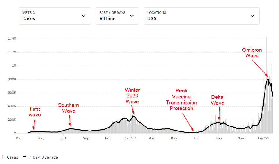
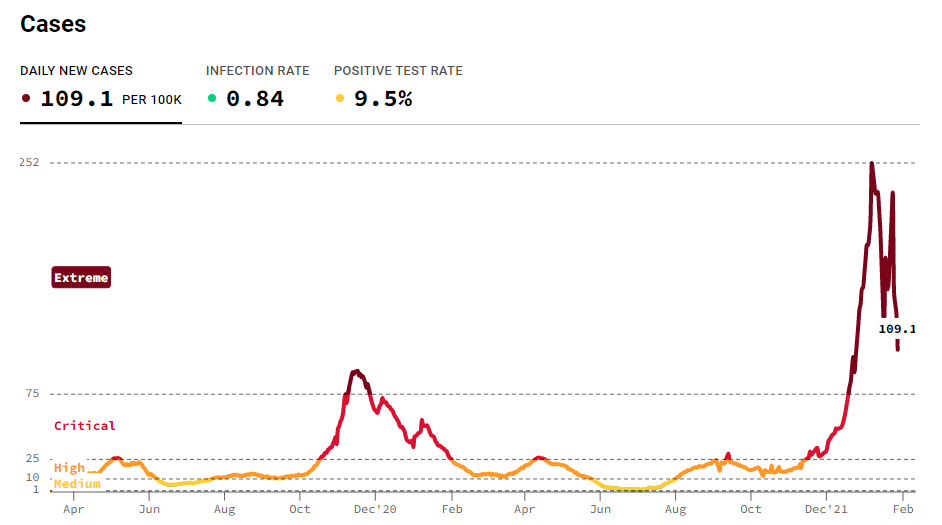
At the high end of the scale, risk is driven almost entirely by the daily new case rate. So thanks to Omicron’s high infectivity, almost everything is the same color again. Basically, it’s all bad. Covid is everywhere. And looking at the historic daily new case data, it’s clear things are pretty bad:
As you can see, this recent surge in Covid cases is much higher than any previous surge of cases, including last year’s brutal winter brutal wave. (The first wave is likely understated due to lack of testing, but I doubt it was this bad.)
The good news is that a lot of people are vaccinated, and that Omicron seems to be a bit less dangerous than previous strains, which means that those cases don’t translate into hospitalizations and deaths the way earlier waves did.
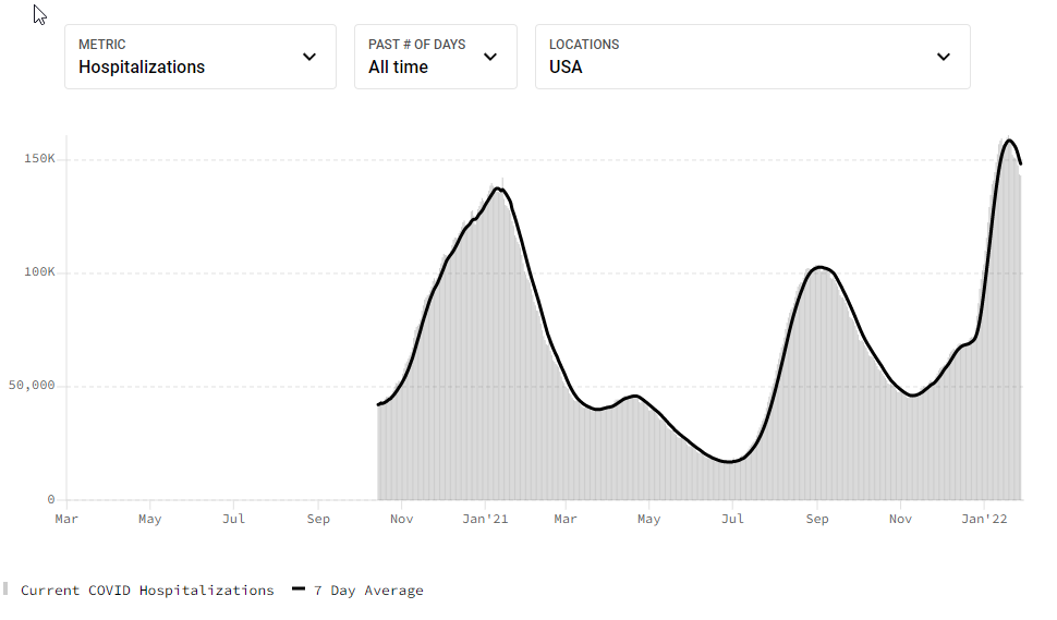
In fact, some Covid skeptics have been dismissing this wave as a “casedemic,” meaning there are lots of cases, but little real harm. This is emphatically not true. Hospitalizations, for example, haven’t gone up in proportion to cases, indicating that this wave is less likely to require Covid patients to be hospitalized, but the number of cases is so much higher than before that the smaller proportion sent to the hospital still rose higher than even last winter’s wave:
(For an idea of what this is like for hospital workers, check out Andy Slavitt’s “A Day Inside the ER During Omicron” podcast, in which Dr. Megan Ranney explains what’s going on in her hospital’s emergency department during the Omicron wave.)
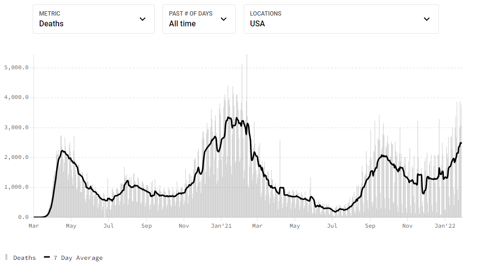
Fortunately, deaths have not followed the same pattern. Not that 2500 deaths/day is a good number, but it’s better than 3000.
Switching to Covid statistics here in the Chicago metro area, things are worse in some ways, better in others:
That recent data is confusing, so let’s zoom in on the last 60 days:
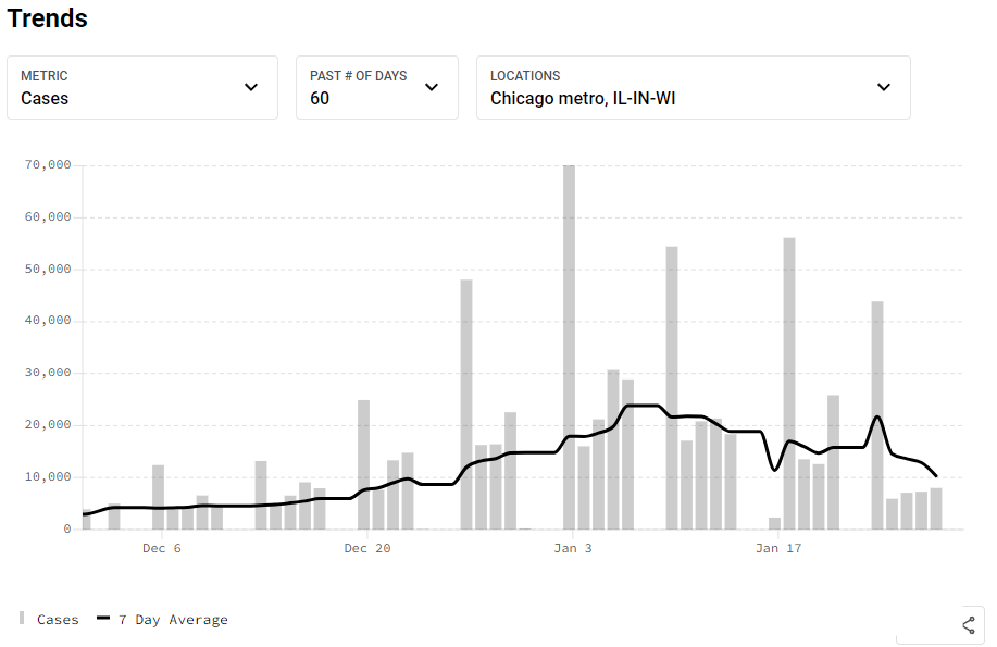
As you can see, despite a few reporting glitches, we’ve had declining new-case rates for the last three weeks. I think that’s a pretty good sign that Omicron is on it’s way out.
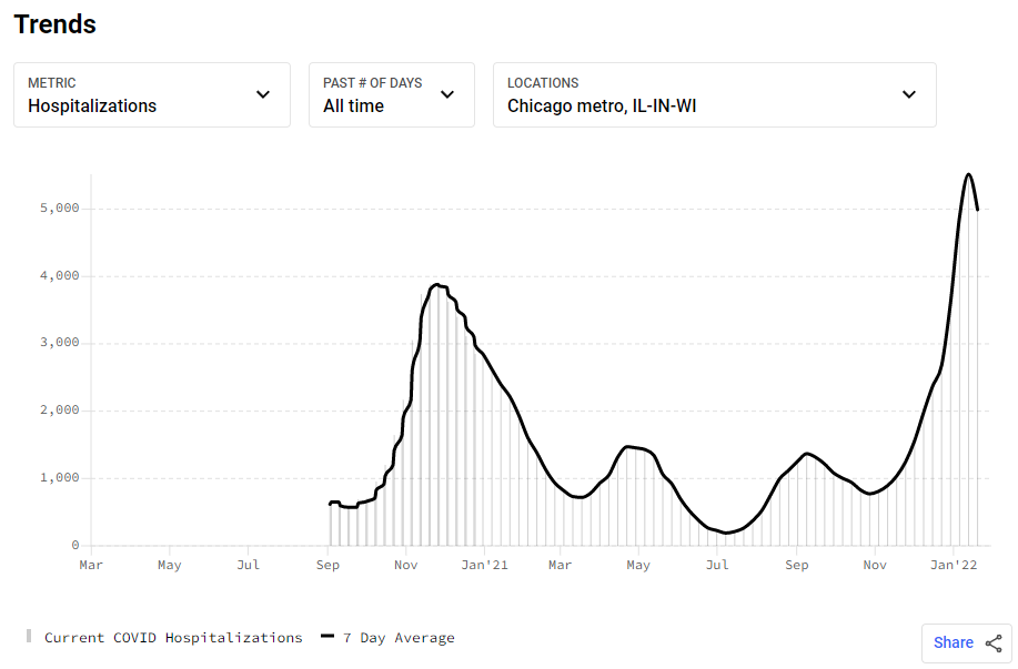
That bad news is that Omicron’s easy transmission rate has led to so many more cases that even the lower per-case hospitalization rate has led to more people in the hospital in the Chicago-metro region for Covid than ever before:
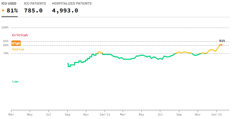
This has pushed our ICU capacity to its most strained level yet:
That’s an aggregate number for the whole Chicago-metro region. If you want to know how things are at your local hospital, the New York Times has a tracking site that shows available ICU beds in every hospital, so you can see if your neighborhood hospital would be able to find an ICU bed for you in an emergency (which might or might not be a Covid emergency).
The good news about hospitalizations here is that they seem to have peaked, meaning that area ERs and Covid wards have survived the worst of Omicron and will soon be returning to more normal operation.
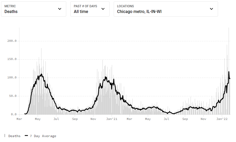
The bad news is that the daily death rate also hit an all-time-high of 117/day, and it’s not entirely clear we’re at the peek yet, since deaths always lag the other Covid statistics.
Still, it looks like we may be at or past the worst of the Omicron wave here in Chicagoland (yes, that’s what we call it). There are reasons to suspect this might be the last major Covid wave we will have to endure. Probably not, but I’m hoping.


Leave a Reply