Like many people, I’ve spend the past year trying to understand what’s happening with the pandemic, and I thought it might be useful to share some of my favorite websites for data on COVID-19 in the United States.
CovidActNow
If you want a one-stop snapshot of how the pandemic is going, start at CovidActNow. They don’t have a lot of fancy data tables and charts. Instead, they boil all that down into some simple color codes.
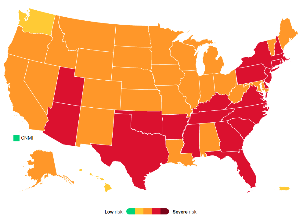
The colors follow a fairly standard green-yellow-orange-red progression, with dark red added late last year to represent the awfulness of the winter surge. This coding system was developed by a group of experts in an effort to find a way to communicate regional COVID-19 conditions in a simple way. You can also get a look at 5 key metrics for any state or county. For example, here’s Kentucky:

Kentucky is coded red because with 35.9 new cases per 100,000 residents, Covid is still quite active (although cases would have to more than double to hit dark red). It will turn orange when cases drop below 25 per 100,000 per day, then yellow at 10/100K/day, and finally green when only one person in 100,000 gets Covid on any given day. (These risk levels thresholds were developed by the Harvard Global Health Initiative).
On the other hand, the infection rate of 0.83 is pretty good news. Infection rate — you’ll sometimes see it called Rt — represents the average number of people who will catch Covid from an infected person. At values greater than 1.0, it means that one infected person passes the infection on to more than one additional person — replacing themselves, and then some — so the number of infected people is increasing exponentially.
With an infection rate less than 1.0, each infected person is unlikely to infect someone to replace them after they recover. It’s sometimes easier to think about it in terms of a population: If 1000 people are infected, an infection rate of 0.83 means they are expected to pass the disease on to 830 more people, who will pass it on to 689 people, and so on. Eventually, only 1 person will get it, and they won’t pass it on, and Covid will be eradicated. At 0.83, that will take a long time, but at least it’s not getting worse.
The positive test rate, a.k.a. positivity, is a measure of testing adequacy for the level of cases the region is seeing. Anything over 20% likely means there isn’t enough testing and you really have no idea how many cases you have. Below 20%, positivity is also a good measure of whether the infection rate is growing or shrinking, independent of the number of tests being done. When this number is small enough, probably around 3% according to most experts, it means your area has enough testing to rapidly find the majority of infected people. And trace them too, if contact tracers have been hired.
ICU capacity coding indicates whether your hospital system is in danger of being overloaded if your region is affected by a surge of Covid cases. Occupancy of 68% is normal for most hospitals, and they can easily absorb a brief surge of Covid cases. However, if the surge is prolonged, and occupancy hits 85%, a continued surge will likely overwhelm them and force them to make tradeoffs. On the other hand, many hospitals have plans to do this as carefully as possible, and as far as I know, no U.S. hospital has been so overwhelmed as to have to make decisions to let some patients die.
The vaccination reports are a new metric, but there’s no color code as yet, probably because there’s no obvious way to set thresholds until we have more information.
The local regional pages also have detailed historic data on several of the metrics (so yes, they do have some fancy charts and tables). There’s also some educational material, including an explanation of the rationale behind all the metrics. And there are also some tools, including an API and embeddable code. As I write this, I’m using the latter to display Illinois gating statistics in the sidebar of this blog.
TL;DR: CovidActNow provides a simple breakdown of the state of the pandemic. And if all goes well, over the coming year we will get to watch all of those states turn green. And never go back.
Big Stats
Several sites offer massive amounts of Covid statistics. Everyone is probably already familiar with the Worldometers Covid page, which allows you to see a snapshot of current statistics throughout the world or focused in on the United States. If you prefer more graphical pizzazz, and a better science pedigree, there’s the Johns Hopkins Coronavirus Resource Center map.

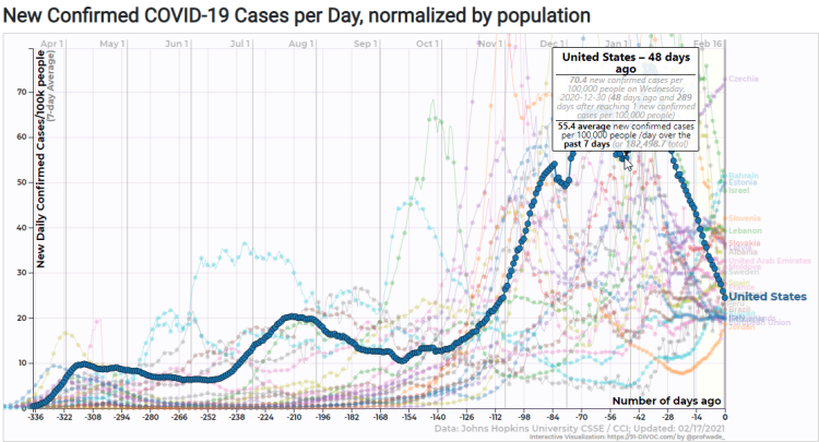
Another good data site is 91-DIVOC, which offers impressive visualizations of Covid statistics, such as this chart of new confirmed cases by day, per country, normalized by population.
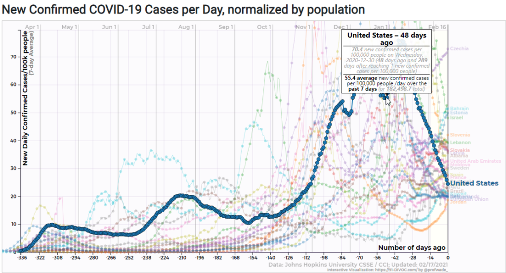
The actual on-site visualizations are interactive. You can see in this screen cap that I was hovering over the U.S. data series on December 30. You can tweak and adjust these to display a variety of different data series with different presentations.
Another site which I’ve just started to explore is the Carnegie Mellon Delphi Group site, which has a lot of health surveillance data, for U.S. states and counties, such as mask wearing percentages, reports of Covid-like symptoms, and mobility data such as time spent away from home and in bars or restaurants.
TL;DR: These sites are data geek playgrounds, offering lots of raw data, charts, tables, and APIs.
I would be remiss in not mentioning one of the earliest sites I used, the Covid Tracking Project. They’re a rag-tag bunch of volunteers that came together to create one of the definitive sources of Covid statistics, relied on by epidemiologists and public health officials throughout the country. Alas, they are shutting down operations in March. They formed to fill the gap created by the lack of good data from the CDC and HHS, but now government sources are finally catching up, and they feel their efforts are no longer necessary.
The CDC
Speaking of government sources, the CDC’s Covid Data Tracker site seems to be adding new information all the time. In addition to the usual stats, like vaccination statistics, a cases and deaths snapshot and the associated trend data, they also have demographic statistics, seroprevalence survey data (measuring the percentage of people with Covid-19 antibodies, presumably because they have been infected) and a geographic pandemic vulnerability dashboard.
One of the things that sets the CDC data apart from the other data sources is that they curate and clean their data carefully. When a public health department revises its data, the CDC revises theirs. If there are reporting glitches or gaps due to missing or misreported data, the CDC data usually fills them in and smooths them over in a way that’s epidemiologically sound. That does tend to delay the CDC data compared to most other sources, but it’s good data.
Finally, for months now, HHS and the White House coronavirus task force have been producing semi-secret weekly COVID-19 State Profile Reports which they have been sharing with state governments, but not with the general public. Those state reports are now available, along with a nation-wide report). These reports are densely packed with terrific data — so terrific that I really don’t know how to use most of it. This stuff is aimed more at public health professionals than people like me.
TL;DR: Government sources are now vastly improved, and the CDC is probably the best source of data.
Models
We all want to know what’s going to happen next, and there are a ton of people running models to try to tell us what COVID-19 will do next.
(Technically, I’ve already showed you a model or two since Rt , a.k.a. infection rate, is a theoretical value that has to be fitted from data.)
There are now so many models that it’s hard to pick any of them, so maybe you’d like to see a bunch of them? Nate Silver’s FiveThirtyEight statistics website has a brief summary of how a bunch of popular models differ and what they are currently predicting. The prediction charts aren’t that useful, especially since they show cumulative values, and in the near-term we’re more interested in daily changes.
Once you’ve read the educational material at FiveThirtyEight, you can see more technical presentations of the model outputs at The COVID-19 Forecast Hub. For example, here is the U.S. ensemble prediction for new cases for each of the next four weeks:
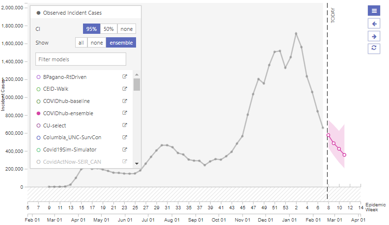
(Note that the figures are per week, not per day.)
This ensemble forecast shows the point value prediction and the 95% confidence interval for a weighted combination of the case rate prediction of all the models combined. You can also display predictions for weekly or cumulative deaths, and you can choose which models you want to see.
The models differ in which data sources they use, the methodology used to make predictions, and most importantly, how they incorporate changes in human behavior. For example, some models assume that current rates of social distancing, masking, and indoor gathering will continue throughout the prediction period. Others make assumptions that people will change their behavior (and government will change their rules) based on the increasing or decreasing severity of the epidemic. This can lead to wildly different predictions, all of which may be valid under their assumptions about various unknowns.
TL;DR: The models are interesting, but there are so many of them.
Miscellaneous
The New York Times has a tracking board for vaccine development, with summary descriptions of the current state of each vaccine candidate and links to news articles.

The NYT also has a similar tracker for COVID-19 drugs and treatments.
Bloomberg has a nice overview of vaccine distribution and administration, with a combination of news, data, and flashy graphics.
If you want to fiddle with the data yourself, here’s one handy list of APIs for Covid information.
Finally, for a different kind of model, check out the microCOVID Project, which is designed to help you estimate your personal chance of catching COVID-19 from various activities. The creators want to encourage us to think about risk in terms of a “microCOVID” — their word for a 1-in-a-million chance of catching COVID-19. For example, if I spend 3 hours hanging out with a friend from the area, indoors, with both of us wearing surgical masks, that’s about 100 microCOVIDs. But if I spend those 3 hours at an indoor party with 10 people from my area, with no one wearing masks, the microCOVID site scores that at 9000 microCOVIDs.
Personally, I don’t find the microCOVID concept intuitive. I end up converting it to a fraction or a percentage. So spending 3 hours with a friend carries 1/10000 chance of of getting COVID-19, but spending that time at the party carries a nearly 1% chance of catching COVID-19.

his is exactly what I am searching for many days. and finely I found it here on your blog. Also, Some days ago as searching for the best video-making and editing software on the internet but, Today I have seen a compersion between https://www.stupidblogger.com/filmora-vs-camtasia.html that provides the best features and services.