
A couple of days ago, I posted about this silly graph, which shows the wage gap between men and women:
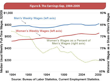
The dotted gray line on the graph at first seems to show that “Women’s Wages as a Percentage of Men’s Wages” are dropping, but that turns out to be because the dotted gray line is plotted against the right-hand scale, which is printed upside down, with the larger numbers at the bottom. I called this a sin against graph design.
My co-blogger Ken suggested in a comment that this might not be such a terrible sin:
I often run into a graph like that where the right-hand scale is reversed when reading scientific papers. It’s often used to emphasize a reduction such as this one. The graph clearly shows an overall reduction in the gap between wages and demonstrates the variations by time.
It’s actually a good graph, but fails to make the point James Park was trying to make. The question is if James Park created the graph with the intention of deceiving, or just copied the graph from an analysis done that Park failed to understand.
A little research indicates it was the second option. The graph appears to be Figure 8 from the report “Women and the Economy 2010: 25 Years of Progress But Challenges Remain” dated August 2010, which appears on the “Women and the Economy 2010 Series” website. The report is credited to “the Majority Staff of the Joint Economic Committee” of the United States Congress.
So, it’s your tax dollars at work. I imagine James Park probably just took the graph from that report without worrying too much about the details. After all, it’s from Congress, right?
In any case, it’s still a bad way to show data. I realize that data sometimes has to be massaged to show results–such as plotting data against a reciprocol or logarithmic scale–but inverting the scale like this just seems wrong, especially since you could just as easily plotted the size of the gap itself, which really would slant downward on a normally-oriented scale.
I suppose one possibility is that for some historical reason wage differential graphs are always presented in this format. That sort of thing sometimes happens. For example, the traditional way to draw supply and demand curves in economics is to put price on the vertical scale and demand on the horizontal scale, which swaps the dependent and independent variables from the usual scientific practice. However, since it was an economist’s blog that first brought his to my attention, this seems unlikely.
Yup. I was just in the middle of writing a new comment about that graph, with the source info.
While the authors did say that the gap remains “high”, this graph was used to support a statement about how “the pay gap between men’s and women’s wages has decreased sharply over the last 25 years”.
Parks spotted a graph with lines that went down and decided it must show something bad. After all, in MBA school everyone is taught that lines going up on a graph are good and lines going down are bad.
Reversing a scale can, however, be used to good effect. Given the accurate description in the source document that came with that graph I thought it was a good use. It clearly does show the data with upward trends along with the decrease in the gap all in one graph. If the right-hand scale would have been “normal” the authors of the original paper could be accused of trying to make the gap appear to be increasing, something that Park did.
I remember a paper on the correlation between plant growth (described as Net Primary Production, or NPP) and CO2 levels. It was a study that busted the myth that higher CO2 levels would cause greater plant growth and thus scrub the CO2 out of the air. The authors wanted to show that, clearly, there was a negative correlation between NPP and CO2 (more CO2 will mean less plant growth), and to show how close the data matched, had to invert the right-hand scale to emphasize the negative correlation:
http://www.windypundit.com/329_940_F1.jpg
I’ve seen similar good uses of inverted scales on graphs.
I suppose the moral is, when making graphs, always clearly label your graphs and be clear about describing what it is representing, and when reading them, to always look at the scales. If a graph isn’t clearly labeled, it’s an indication that someone is trying to be dishonest.
Yeah, the graph you link to is inverted to make a very specific point, and the CO2 data series is clearly labeled as inverted. On a not entirely unrelated matter, the graph you link to is also uglier, which is sometimes a hint. Good data doesn’t need fancy presentation.