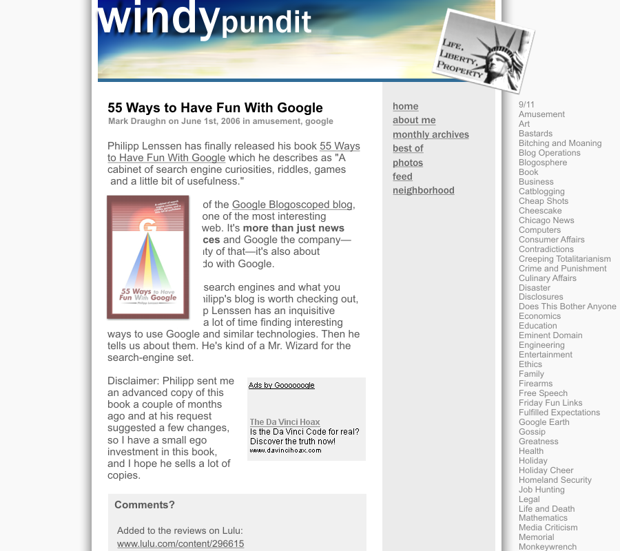
I’ve had the same basic layout on this blog for about a year now, and I’m getting a little tired of it. So I decided to make some changes. By the time you read this, the first layer of changes will be in place, so if you want to see the design I’m tired of, you should look at this screenshot. (If it’s hard to read, you need to tell your browser to display it full size. If it looks ugly, you’re seeing it correctly.)
I needed some help, so I emailed Philipp Lenssen, the proprietor of Google Blogoscoped, for a little advice.
I’m thinking that I’d like to try to build up my blog into a little more of a web presence, and I’m wondering if you would mind taking a look at it with an eye toward increasing traffic to my site. Sort of like an informal SEO advisor…
I have two goals in mind:
1. Attracting attention to myself.
2. Making money.What I’m looking for is kind of a close-reading of the structural elements of the blog, links, google stuff, things like that, as well as advice on posting and marketing practices.
Philipp knows a lot about search engines, and he’s working at becoming a professional blogger, so I figured he’d be a good source of advice. I also like his approach to improving search-engine results for a site, which I would characterize as post great content, make a name for yourself, let other people link to you.
It was some article of Philipp’s that convinced me to create an About page with my picture on it and put up a best-of section in the sidebar. The best-of list helps first-time visitors get a better sense of me and the bio and photo make it easier to get to know me, and therefore to rememeber my blog.
Of course, I had some limits:
I’m not planning any major content changes. I know I could get more traffic as a single-issue blogger, but that’s just not going to happen. I’m probably not willing to avoid the puns and allusions in my article titles either :)
The next day, Philipp sent me a list of suggestions, most of which were pretty good, and some of which I was willing to do. He also included a mock-up design for my the new Windypundit.
That design is a little too extreme for me, and some of his suggestions don’t fit my blog’s purpose, but most of what he had to say was dead-on. Based on his suggestions, I’ve already make a number of changes:
- I removed the repeating “skyscraper windows” background image and just left the background almost pure white.
- I got rid of the borders around my photographs, but I left them in place on all the other images (downloaded from othe blogs, promotional images, stuff like that).
- I grouped the main body and left-hand columns together, and added borders that help suggest it’s a separate piece of paper.
- I added more whitespace between the left and center columns.
- As in Philipp’s example, I left the right column “lying” on the background.
- The left sidebar now has a pure white background. (So does the center, but it always did.)
- Philipp suggested I switch to a sans-serif font, but fonts without serifs often look awkward to me in large blocks of text. On the other hand, not even the New York Times uses the Times Roman font on their web page like I did. My solution was to use the Georgia font. It still has serifs, but it’s a more open and inviting font than Times Roman. Also, it’s the font the New York Times is now using on their website.
- I separated the banner at the top from the rest of the blog with some whitespace and a heavy border.
- I lightened up the banner image to go with the generally lighter look of the whole page.
- I removed the dark and ugly ad boxes that appear on the individual archive pages.
Nearly all of these changes were accomplished through changes to the CSS style sheet. I didn’t have to change any HTML generated by the blogging software, except to remove the ad blocks. (They just had to go.)
I’m still planning a few more changes, but some of these will be more work to do:
- Generally brighten up the colors of the blog.
- Replace the NASA shot of the Chicago beachfront with some other photograph of my own to fit the newer color scheme.
- Get rid of the purple color used for visited links. I’m not sure why that’s there, it’s not one of my design colors.
- Re-arrange the navigation features, icons, and badges of the blog, so they don’t contribute to making this blog look exactly like all the others.
- Either use a smaller banner image and move it down into the “page” with the main text—allowing the right hand column to rise to the top of the window—or move a bunch of navigation features up into the banner area so it functions like a control panel for the blog.
- Maybe quit some of the TTLB communities and remove their links from my blogroll.
- Make the Windypundit logo a bit larger.
Update: Here’s what I did in phase 2 of the blog makeover:
- I couldn’t find any photos in my own collection that would work well in the header, so I bought a Chicago lakefront photo by Matt Dula from iStockphoto for $3.
- I decided that muted colors work better for the type of content I’m publishing, so I won’t be adding brighter colors. However, since the new photo doesn’t have large patches of brownish-yellow like the old photo did, I got rid of the brownish-yellow accents in the headlines and sidebar links and replaced them with a light blue.
- I got rid of the purple links, although some of the blue ones are looking a bit purple-ish.
- I made the banner image smaller, and moved it down into the smaller “page” within my main page—allowing the right-hand column to rise to the top of the window.
- I put the Best-Of section and Department list into pop-up menus on the right-hand side to remove some clutter from the left margin.
- I built my own vector version of the Windypundit logo in Photoshop, which gives me a lot more control, so I made it bigger and I made it blue instead of white.
- One of my design points is that every clickable part of the page should have a rollover response to emphasize that you’ve found something you can interact with. Since I have my own version of my logo, I made a white version which I use for the rollover. Some of the link icons to other sites are still static, but I think everything I provide now has a rollover response.
- Philipp wanted me to move the Google ads out of the left-hand column, but my ad revenue more than doubled when I moved the ads from the right-hand column to their current position. I’m scared to move them somewhere else. As a compromise, I’ve slid the left-hand column down the page a bit so the reader’s eyes will read the headline first.
There are still a few things left to do:
- Continue re-arranging the navigation features of the blog so it looks a little cleaner.
- Replace my rickety home-grown menus with a bulletproof menuing system off of some JavaScript web site.
- I’m still thinking about quitting some of the TTLB communities.
- Maybe add a few colored accents.
Leave a Reply