No, this isn’t a rumination on whether Biden should be replaced as the Democratic nominee. It’s an attempt to display some election modeling data in a useful way.
Nate Sillver’s old FiveThirtyEight blog used to have a pretty nifty “snake” diagram showing the states in order by likelihood of victory for each of the two major candidates. Each state’s segment had a length proportional to the number of electoral votes. This made it pretty easy to see the battleground states and how important they were.
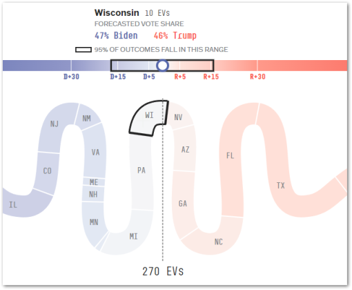
The new 538 blog (sans Nate Silver) has a similar graphic at the bottom of this page. Here’s a snippet, with data for Wisconsin selected:

I don’t find that as useful as the old graphic. First of all, the values associated with each state represent the vote share for each candidate, not the candidate’s odds of victory. That’s useful, but it doesn’t give us a good feel for how hard it would be to flip a state. Is a 5% margin likely to disappear by the election? Or is it insurmountable? What we really want to know is not the margin of victory, but the probability of victory.
Second, this is no longer Nate Silver’s election model. When ABC News/Disney decided not to extend Silver’s contract at FiveThirtyEight, they didn’t realize (or maybe didn’t care) that Silver owned his election model, and they were only licensing it. So Silver took his model and went home, and ABC rebranded the site to 538.
I’m not exactly a Nate Silver fanboy, but I do admire his election model. He took it to his Silver Bulletin website, where he and Eli McKown-Dawson are trying to restore it to its former glory. It’s producing different results from the ABC model. For example, the ABC model is showing Biden with a 51% chance of victory to Trump’s 49%. The Silver Bulletin, however, is much less optimistic about Biden’s chances, giving him only a 28.0% chance of victory to Trump’s 71.4%.[1]The missing 0.6% is the chance of a tie.
Silver’s full model report is here, and it has lots of interesting data…but not the old snake diagram.
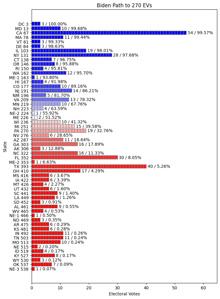
Discouraged, I set out to produce a chart of my own that showed something similar to the old snake diagram. Fortunately, Silver makes makes the state-by-state forecasting output available for download, so all I’m doing here is generating the chart. And to be clear, I have neither the time nor the skills to reproduce a graphic of the quality of the original snake diagram. But I think I can squeeze in enough forecasting data to make it easier to understand what’s going on.
The states are listed down the left side, from most likely Biden victory to least likely Biden victory (i.e. most likely Trump victory).[2]I’m ignoring the model outputs for Robert F. Kennedy Jr. They are unlikely to affect the electoral vote count, and incorporating them would make this a lot harder. The numbers next to each state are the cumulative number of electors that Biden would get if he won that state and all the more likely states. Note that Maine and Nebraska are the only two state that are not winner-take-all, so this chart shows each district separately for those states.

Each horizontal bar is proportional in length to the number of electoral votes that state contributes. The trailing numbers are the number of electoral votes followed by the forecast’s predicted probability of Biden winning those votes. The states in the middle, where blue shades into red, are the “battleground” states.
Based on this forecast, Biden would have to win every state that’s leaning blue, including on-the-fence Maine and the Nebraska 2nd, plus he has to flip at least the first three Trump-leaning states, Wisconsin, Michigan, and Pennsylvania, in order to win 270 votes and take the Presidency for a second term. Those are the main battleground states, along with maybe Nevada, Arizona, and Georgia — maybe he could flip one of those if not all of the first three. Any states below that are going to be really hard to flip. On top of that, he has to keep Trump from flipping Maine, the Nebraska 2nd, New Hampshire, Minnesota, and Virginia.
(As I write this, Silver is reporting that the debate is not fully reflected in these numbers because several key polling organizations have not yet returned post-debate results.)
Footnotes

[…] I mentioned in a previous post, I’m looking at some of the election forecast data to try to figure out how things are going […]