I saw that Donald Trump retweeted this and — after getting over the fact that the President of the United States was retweeting pandemic analysis from an anonymous dude calling himself “bad cat” — I wanted to respond to some of the things in the thread:
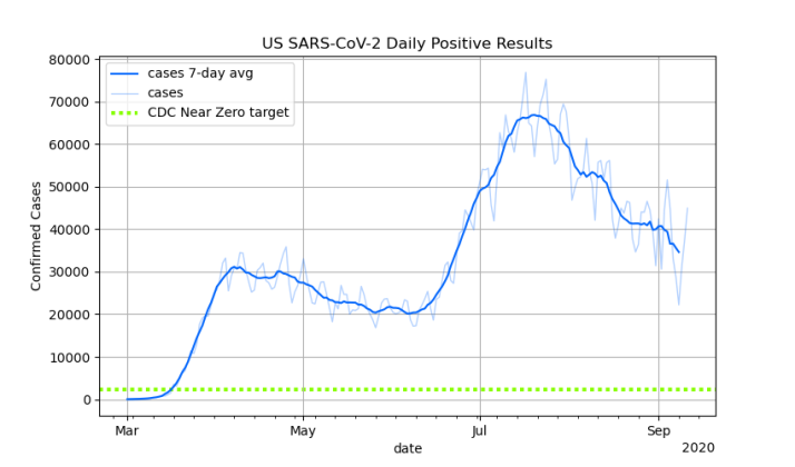
In general, he’s talking about charts of confirmed U.S. Covid-19 case counts per day, like this one that I posted on Friday:

First of all, the part about the second peak not being a second wave seems reasonable. I think it’s more accurate to describe that second peak as the the first wave sweeping over new population centers. When you break the U.S. down into smaller regions, there to appear to be single high peaks occurring at different times in different locations. On the other hand, I’m less convinced this is seasonal, rather than a simple matter of transmission dynamics: Transmission between metropolitan areas is somewhat bottlenecked compared to transmission within metropolitan areas, so spread from initially hard-hit metropolitan areas to new metropolitan areas takes time, but once it reaches a new metropolitan area, it explodes. But that’s just a theory.
El gato malo’s main argument appears further back in the thread, and he has some theories too.
The issue I have with el gato malo’s chart here is that by showing the line adjusting for testing level, he’s no longer just presenting data. He’s presenting a model. That’s not an unreasonable thing for someone to do when commenting on Covid-19 issues, but I think it would be a bad idea for the news media to invent their own model and report it as news, as el gato malo suggests. That, not reporting the raw numerical facts, would be “tantamount to lying.”
I disagree. Health agencies should not be reporting model outputs unless those models are well-established. Otherwise they should stick to publishing raw data, as should most journalism sources. Those of us who want to look at models can find (or build) them for ourselves.
The use of models is especially concerning because there’s usually more than one model for anything, and it’s entirely possible that a particular model promoted by a news outlet is wrong. Heck, they could all be wrong. As el gato malo’s model is.
The cat doesn’t include an explicit formula, but from what he wrote, his model for the true rate of infection appears to assume that for any given number of cases in a population at a point in time, the number of cases detected will be proportional to the number of tests run. He refers to the number of tests as the “sample rate” and mocks epidemiologists for not understanding sample rates:
The thing is, “any first year stats student” would be dinged on an exam for this mistake. Let me explain what El Gato Malo is thinking by describing an example where he would be right:
Suppose you’re a veterinarian at a national park and you want to know how badly the deer in the park are being hit by some deer disease — call it Bambi Syndrome 19. So you go out and take blood samples from 20 deer at random, and you find that 6 of them test positive for BS-19. Now that you know the disease is affecting the park’s deer population, your staff gets funding to do a larger survey to get a better picture, this time taking samples from 200 deer. You discover that 48 of them test positive for BS-19. Do you start panicking because eight times as many deer tested positive in the second survey as in the first?
Of course not. The second survey included 10 times as many specimens, so you’d expect a proportionate increase in positive results. The fact that the first survey had a 30% positive test rate, and the second only had 24% positivity is actually a good sign, because the problem probably isn’t as bad as the first survey indicated. In other words, when doing random samples, we should look at percentages (or ratios) of positive tests, not the absolute number of positive tests.
This is how el Gato Malo thinks we should treat Covid-19 testing. But this kind of thinking only works for random samples. A long as you’re taking random samples of a population, it’s safe to assume that, all other things being equal, the number of positive test results will be proportional. But Covid-19 testing in the United States doesn’t use random sampling. It doesn’t even come close.
Going back to my national park example, it’s as if the rangers brought in 10 sick deer (I have no idea if animal care at national parks really works this way, but go with it) and you diagnosed 9 of them with BS-19. (The 10th one was sick for an unrelated cause.) That’s 90% infected, which certainly gets your attention.
So now you send the rangers out to find more sick deer, and they eventually bring you 100 sick dear, of whom 50 test positive for BS-19. This is only 50% instead of 90%, but 50 sick animals is pretty serious, so you get funding for a large population survey, and the rangers test 1000 deer at random, and 240 of them (24%) test positive.
These are not comparable samples. The first group of deer was so sick that the rangers spontaneously decided to bring them to your attention. The second group was selected according to a plan, but they were all recognizably sick. Only the third group was a random sample. So is the disease getting worse because more deer have it in each round of testing? Or is it getting better because a smaller percentage of deer have it each time? Or is the disease holding steady and only the testing methodology is changing? It’s really hard to tell.
That’s why El Gato Malo’s use of the sampling rate model is wrong: Covid-19 testing (SARS-Cov-2 to be pedantic) in the United States has not been a clean and tidy random sampling process. It’s been a messy collection of testing and reporting policies that differ between locations and between different time periods in the evolution of the epidemic. And with the exception of screening and survey testing, most of the early techniques were highly motivated to find infected people, because those are the people in need of treatment and quarantine.
Testing began with emergency room doctors testing patients with severe respiratory infections to determine a course of treatment. Many of these tests were positive, because doctors were testing people they had identified as probably having Covid-19. As more tests became available, doctors began testing patients with milder symptoms, in the hope of catching the problem earlier. Eventually, they started testing people who had merely been exposed, even if they had no symptoms at all. Pretty soon test-and-trace teams began actively looking for people with Covid-19, and hospitals began testing all patients as a matter of course. In many places, you can now get tested simply by asking, and a number of companies are routinely testing their employees. Eventually (I hope), we will be doing over 100 million tests per month, and nearly all of them will come back negative. At some point, you’ve found all the cases, and no amount of testing can change that.
The point is, Covid-19 testing has been subject to decreasing returns. The more tests we do, the more positive results we’ll get, but each increase in testing produces a smaller increase in positive tests. When we first started getting test statistics, it only took about 4 or 5 tests to find a new case. Today it takes about 20 tests to find each new case of Covid-19. In some places, like New York State, it takes over 100 tests to find a single new case of Covid-19.
This means you can’t just blindly do linear extrapolation like the cat is trying to do. We don’t know the math governing this particular example of diminishing returns, because the situation is so complicated and we have no direct evidence of the correct answers, so there is no simple theoretical way to relate testing volume to the prevalence of the disease.
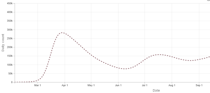
An arguably better approach is to use transmission dynamics modeling to model the spread of the disease, and back-project to estimate historic data. For example, using historic death rates, which we do have, the IHME model’s back-projection of the true infection rate looks like this:

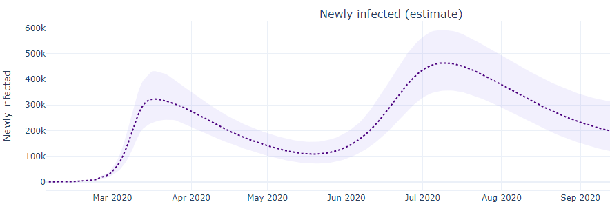
That looks a bit like El Gato Malo’s estimate, with the first peak worse than the second. On the other hand, here’s a different back projection from the MIT model, which has the second peak as more severe:

Which one is right? I don’t know. You could argue that the IHME infected curve is a better fit to the historic death curve, but you could also argue that the MIT model has a better track record of making predictions, which is the true test of a model. And there are other models besides these two.
Make no mistake, I think el gato malo is right about the big picture: Some of the increase in cases is due to an increase in testing, so the summer peak isn’t as much worse than the spring peak as it might seem. But remember, no increase in testing can create Covid-19 cases that aren’t there. The summer peak is not an illusion that is better than it appears because of increased testing. The spring peak was the illusion, and it was worse than it appeared, because we didn’t have the ability to find cases as thoroughly as we do now.
If you’re commenting on Covid-19 news, as the cat and I are, it makes sense to show model outputs and present arguments based on them. But I don’t think objective news sources (or public health agencies) should be reporting unproven models as if they were facts. News sources owe it to their customers to report accurate and objective raw data. Leave the interpretation to somebody else.
(Personally, in my weekly Covid-19 stats tweetstorms, I almost never show charts of raw case rates without showing testing data somewhere nearby, and usually positivity as well, so people can reach their own conclusions. I am considered trying to calculate some model outputs, such as number of people currently infectious, but I’ve so far managed to resist the temptation.)
Leave a Reply