More About That Graphic Sin - Windypundit
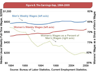
A couple of days ago, I posted about this silly graph, which shows the wage gap between men and women: The dotted gray line on the graph at first seems to show that “Women’s Wages as a Percentage of Men’s Wages” are dropping, but that turns out to be because the dotted gray line is plotted […]
Mark Draughn